On this page: Eight attempts and a two-sentence restart · Test 1 · Test 2 · Test 3 · Test 4 · What each test can’t tell you · Try it
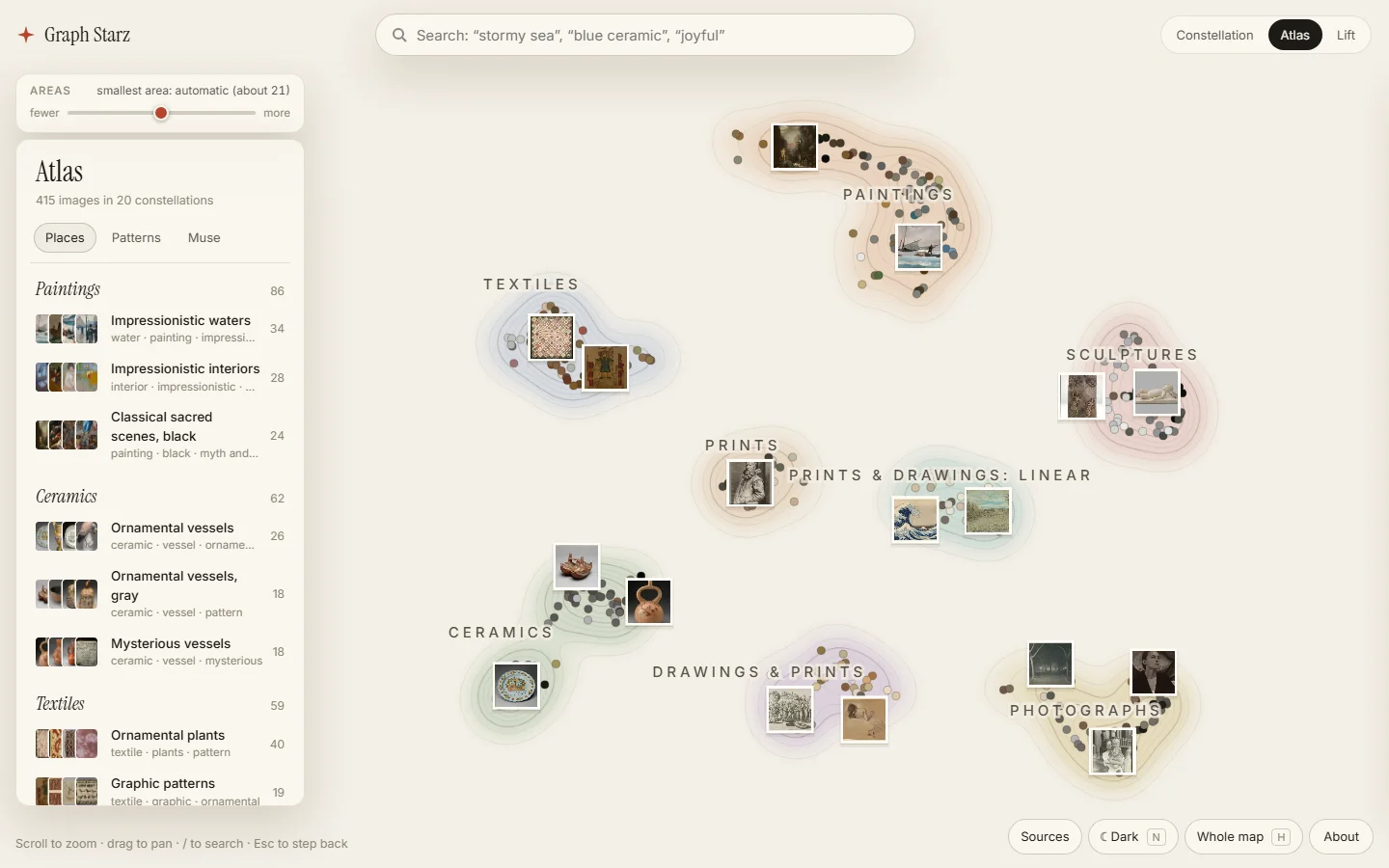
Graph Starz turns a collection of pictures into a map you can explore by how they look and what they show. I’d started it eight times since July 2024, and most of them spent their time on sign-in, uploads and servers before the map was any good. This time the map came first, and once it looked good I kept asking one question: is it good because of the method, or because of these 415 pictures? Each time I asked, it turned into a test, and this post is those four tests. All of it is live at graphstarz.com.
Eight attempts and a two-sentence restart
The eight earlier attempts, counting a one-week search experiment, planned a 3D universe and built a graph database, a queue-based upload pipeline and more. In September I had Claude write all of them up in one document: what each tried, where it stalled, and what it taught me. Then I shut the project down.
On October 11 I changed my mind and told the Claude Code session that coordinates my projects:
“I like the concept of graph starz, i think we just had trouble with making it beautiful and usable while still having a cutting edge graph UI. It would be great if we could try again.”
That session turned those two sentences into a brief for a fresh session running Claude Opus 5.5 and pointed it at the write-up. The new session read the document in full before writing any code. What each attempt had tried, and where it stalled, was already written down, so it didn’t need more from me.
The brief’s first rule came from that history: no sign-in, uploads, server or database until the map had earned them. Those were the parts the attempts kept rebuilding. In the first one, infrastructure and deployment changes came to about 11,400 changed lines, against about 6,300 for the front end. Starting from a fixed, openly licensed collection, 415 works from the Art Institute of Chicago’s open-access images, meant the time went into the map.
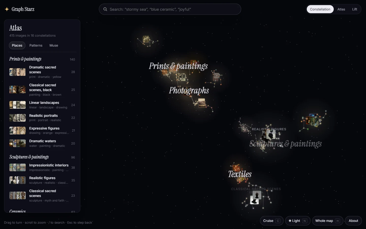
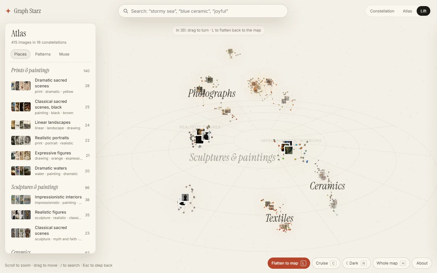
About an hour in, Claude Code offered three design directions and asked me to pick one: Constellation, a 3D night sky; Atlas, a flat map drawn like a paper atlas; and Lift, a flat map that rises into the sky. It recommended Atlas. I liked Atlas, then wondered how it looked in dark mode, and by that evening I’d stopped trying to pick:
“I want to support all 3 honestly, in light and dark mode”
So all three became views of the same map. Switching keeps your open picture and your search. Atlas is the clearest way to find something, Constellation is better for wandering, and Lift shows how the two relate.
Test 1: add the pictures one at a time
The map is built from the pictures, not drawn by hand. Each picture is a star; look-alike stars gather into named constellations, and constellations into regions. A model describes each picture with words from a fixed list of media, styles, moods and subjects. Color is measured from the pixels. A visual fingerprint, a list of numbers a picture model gives each picture so that look-alikes get similar numbers, says what each picture looks like. The layout combines the fingerprint with the words, and the constellations, regions and their names all come out of that.
The map looked good. So I asked:
“How much of this is tailored to the data to make it look good, vs how much was auto generated? Could we try simulating what it would be like if the user added these photos one at a time? Would it still look this good?”
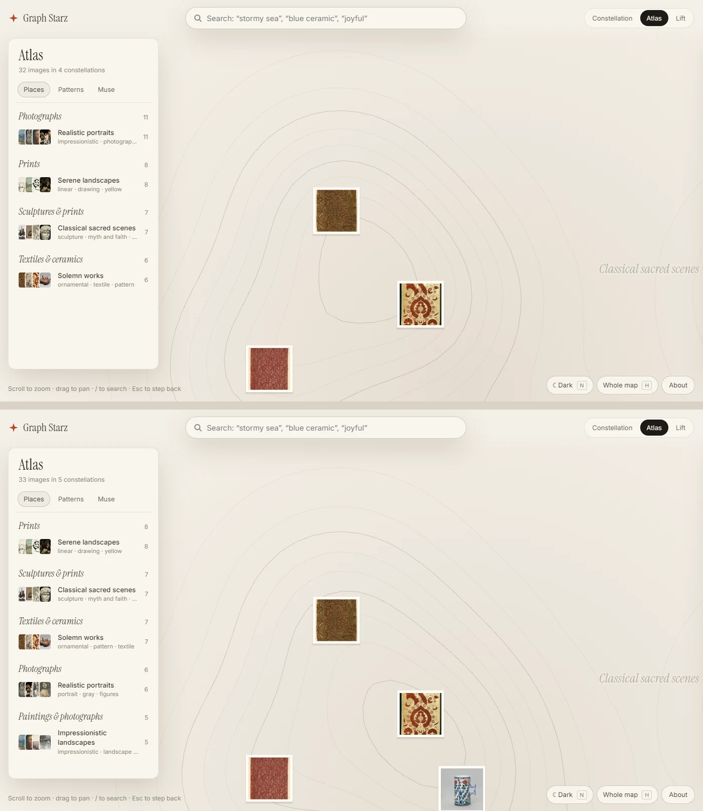
The test is simple to copy: start from nothing, add the pictures one at a time in a fixed order, rebuild after each addition, and measure what moves. It answered the question quickly. A typical existing star moved about 40 percent of the map’s radius with each addition, even after lining each new layout up with the old one to discount rotation and reflection. A third to a half of the constellation names changed. The build crashed below 15 pictures. In a collection of only photographs, every region was named “Photographs.”
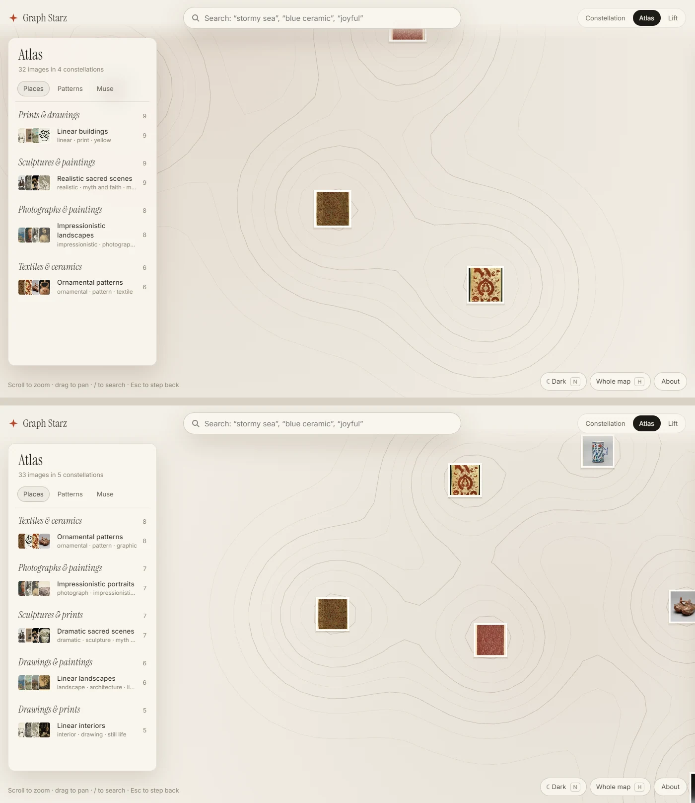
The fix was to grow the map from its previous state. Between redraws, existing stars stay where they are and new pictures settle beside their closest look-alikes. A name stays while its words still fit the group. The map redraws only after the collection has grown by a set amount, then lines the result up with the old map and hands names to groups that kept the same pictures.
That fix had a measurable cost. At 415 pictures, 40 percent of each picture’s ten closest look-alikes, measured from its fingerprint and its words, sat among its ten closest stars on the grown map. A map drawn fresh reached 55 percent. Letting old stars drift back toward a fresh layout made both stability and neighborhoods worse, so I took the stable map and its cost.
Test 2: replay a bulk import
Nobody brings a collection one picture at a time. Someone with an existing library brings hundreds at once, so the next test had to look like that:
“test bulk, I’m curious how large we can grow the graph while keeping it beautiful and inspiring like this”
The replay added Art Institute pictures in 42 simulated uploads, from 415 to 3,403, and saved the map at checkpoints along the way. The map stayed steady and fast, but it got harder to read past about 1,500 pictures, in five specific ways:
| Problem at 3,403 pictures | What changed |
|---|---|
| Never more than five regions, so names stopped describing what was in them | A region splits when no single kind of picture covers three quarters of it. Pictures whose region name fits them went from 72% to 88%, averaged from 1,000 pictures up |
| Zoomed out, a field of overlapping dots | Regions, then constellations, then pictures, switched by how crowded the screen is |
| Look-alikes drifting apart between redraws | Redraw each time the collection grows by half instead of doubling |
| The word list stopped learning new words | The bar a new word must clear is capped at 25 pictures |
| One thumbnail image 7,552 pixels wide, too large for many phones | Thumbnails in small sheets, and the map file loaded in pieces |
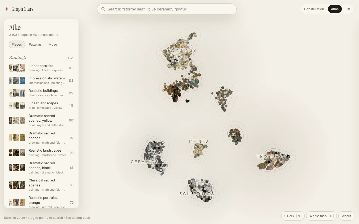
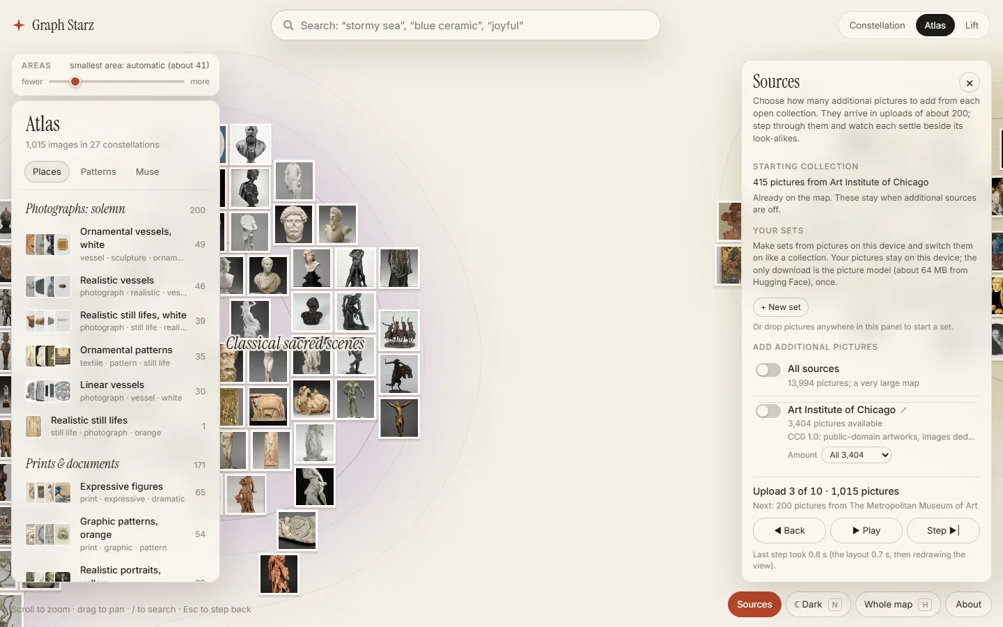
Then the replay became part of the site. Sources adds pictures from public collections about 200 at a time. Step adds one upload, Play runs the rest, Back restores the previous map, and switching a collection off takes its pictures away. A replay of the same engine with all six public collections switched on took the map to 13,394 pictures over 65 uploads.
Museums are a kind collection, though: mostly paintings, prints and objects. A seventh collection tests the opposite, 600 pictures from Wikimedia Commons of screenshots, charts, maps, pixel art and comics. With it switched on, the map first split into 22 top-level areas, 16 of them holding a single cluster. A rule that a new area must be at least the size of a typical cluster brought that to 10. You can now move that size yourself with an Areas slider on the map.
Test 3: score the neighbors against facts
Tests 1 and 2 check that the map stays put and stays readable. They don’t check that a picture’s neighbors are right. Graph Starz used CLIP, a small picture model from 2021, for its fingerprints, and once I could add my own pictures I asked what else could place them better:
“I want really high quality on the connections and position of images in the graph (good classification).”
The trap here is grading a picture model with another picture model. Museum records avoid it: they say who made a work, what kind of object it is and what culture it comes from, and no model produced any of that. So the comparison took 2,224 of our pictures, found each one’s ten closest pictures under each of 16 models, and counted how many really belonged with it.
| Model | Same artist | Same object type | Same culture | Off-museum kind | Browser download |
|---|---|---|---|---|---|
| CLIP B/32, the old model | 18.1% | 57.0% | 17.8% | 68.2% | 89.1 MB |
| SigLIP 2 base, browser weights | 21.0% | 60.7% | 22.4% | 74.5% | 63.5 MB |
| SigLIP 2 large, full weights | 24.4% | 62.7% | 24.1% | 76.9% | 206 MB in the browser |
| Gemini Embedding 2, a paid service | 29.3% | 61.6% | 22.7% | 76.6% | needs a server |
SigLIP 2 base beat the old model on every measure with a smaller download. Its cost is speed in a browser that can’t use the graphics card: about eight times slower per picture. Most of the map doesn’t feel that, because every museum picture is fingerprinted once, ahead of time. Only a visitor’s own pictures are fingerprinted in their browser.
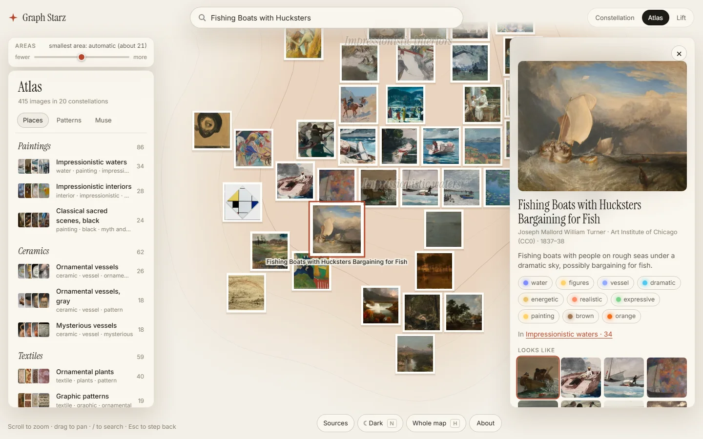
After the switch, measured the same way on 2,000 pictures from the public collections, a picture’s related pictures were by the same artist 21.6% of the time, up from 18.2%, and the same type of object 55.4% of the time, up from 52.3%. Turner’s Fishing Boats with Hucksters Bargaining for Fish used to list Tetards (Pollards), Souvenir of Tuscany and Hercules and the Lernaean Hydra among its look-alikes. It now lists The Herring Net, The Gulf Stream and Stowing Sail.
Test 4: judge it blind
Records measure what museums record. They don’t measure whether I’d agree that a row of pictures belongs together, so the last test is my own eye, with the labels hidden. I used it twice.
The first time was for the word list. The vocabulary can grow when pictures need words it doesn’t have, and something has to decide whether a new word is really new, a narrower kind of an existing word, or another name for one. In one early run, plain word similarity merged “african” into “black” and “text” into “textile.” I tried two models for those decisions, Gemini 2.5 Flash and Jev, a decision model available through OpenRouter, and then judged 46 of their disagreements without seeing which model gave which answer. On the 20 disputed word relationships, Gemini matched me 12 times and Jev eight. My answer was “keep them different” 16 times out of 20. So the rule that shipped is conservative: Jev files a word into a family, and two words merge only when both models agree.
The second time was for the picture models. A judging page showed 50 pictures, each with two unlabeled rows of its six closest pictures from two different models, and I picked Left, Right or Same. The rule was written before I judged: if the newer models won about 14 or more of 20 decided comparisons against the old one, that would favor switching. I picked Same on 44 of the 50. Against the old model only three comparisons were decided, and the old model won two.
So by eye, the newer models weren’t visibly better six pictures at a time, and by the rule written beforehand that meant keeping the old model. Nobody had pointed that out when I answered: the session had recommended switching without mentioning the rule, and I replied with one word: “switch”. A reviewer of its write-up caught the omission a few minutes later, and the session told me and offered a way back.
I didn’t take it. The rule had assumed the slowdown hit everyone, but it only touches visitors’ own pictures, not the map. And the judging page only showed rows of neighbors, not tags, where the gain was bigger: in the comparison, agreement with Gemini on a picture’s medium, for pictures tagged in the browser, went from 67% to 81%.
What each test can’t tell you
- The replays are simulations. They add real public pictures in an order I chose. As far as I know, nobody outside the project has uploaded a library yet, and Your sets keeps pictures on the visitor’s device, so I wouldn’t see it if they had.
- Museum records are a narrow judge. Same artist and same culture are good signs, but they aren’t taste, and most of a person’s own pictures won’t come with records.
- The blind test measured first glances. Half of my answers came less than about 2.5 seconds apart. A slower comparison might have found differences.
- Phones and newcomers are untested. I haven’t measured speed on a real phone, and I haven’t yet watched someone who didn’t build the map try to find something with it.
Try it, and run these on your own project
Everything above is live at graphstarz.com: the three views, Sources with seven public collections, the Areas slider, clicking a tag to light up every picture that has it, and Your sets, which adds pictures from your own phone or computer. Your browser tags them itself with the same picture model the map uses, so they never leave your device. The Graph Starz project page keeps the current details in one place.
If you’re building something that arranges or recommends things with AI and it looks good, these are the four checks I’d copy:
- Add the items one at a time in a fixed order and measure how far existing items move and how often names change.
- Replay a bulk import with checkpoints, at the sizes your users will really bring, and write down what gets harder to read.
- Score neighbors against facts no model produced, like an artist, a category or a date, rather than asking another model.
- Judge two versions blind, with a rule for what counts as a win written before you look.