Supergraphic Panel is the dark, chromed visual language behind the chat-arch viewer, published as three public URLs so any Claude Code project can adopt it. This post is the shortest path from “I want that look” to a working page.
The three-line CLAUDE.md snippet
Paste this into your project’s CLAUDE.md:
Visual style reference: https://chat-arch.dev/design-system/
Machine-readable tokens: https://chat-arch.dev/design-system/tokens.json
LLM discovery: https://chat-arch.dev/llms.txt
The first is the human-facing walkthrough. The second is DTCG 2025.10 tokens (palette, fonts, radii). The third is the /llms.txt discovery index that links to the full prose spec.
The prompt
With the snippet in place, run this verbatim:
Read https://chat-arch.dev/llms.txt and the linked spec.md in full before writing any code. Apply the Supergraphic Panel design system to this project — pay special attention to the
.lcars-rootwrapping rule, the instance-local--source-color/--mode-colorpattern, and the asymmetric elbow radii, which agents often miss. Start with a single landing page containing a hero, a three-card feature grid, and a footer. Use the palette, typography, and component patterns from the spec verbatim.
The three named callouts (.lcars-root, inline --source-color, asymmetric radii) are the agent-miss risks the spec flags explicitly. Including them in the prompt saves the first iteration.
What you’ll get
First render should produce:
- The whole tree wrapped in
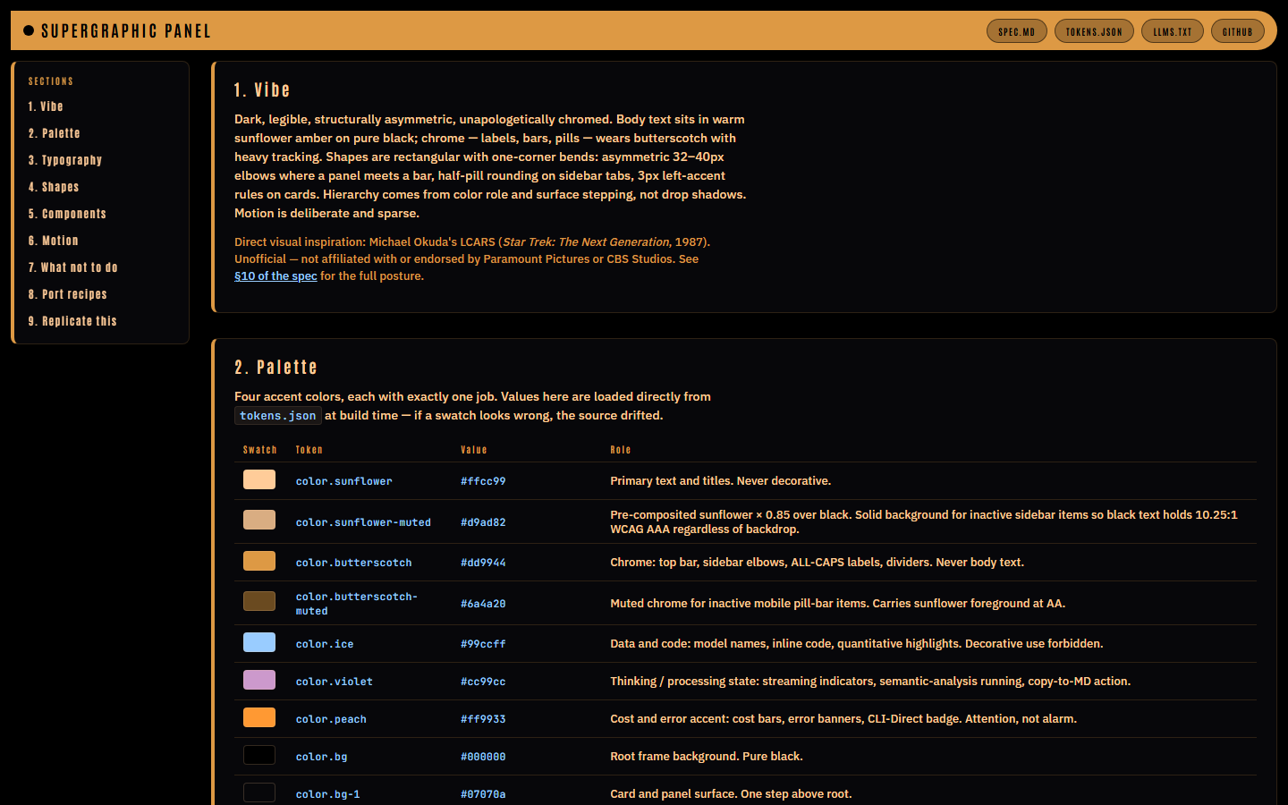
<div class="lcars-root">; tokens on that class, not:root. - Pure-black background (
#000000),#07070acard surfaces,#0d0d12card hover. - Butterscotch
#dd9944top bar; Antonio ALL-CAPS atletter-spacing: 0.14em+on chrome. - Sunflower
#ffcc99body text, IBM Plex Sans inside cards, JetBrains Mono on numbers and identifiers. - Cards with 3px left-accent rules in their
--source-color, asymmetric 32–40px elbows (radius.elbow/radius.elbow-lgin tokens.json) where bars meet panels. - No in-frame drop shadows — hierarchy via color role and surface stepping (
bg→bg-1→bg-2).
If the output looks like generic Tailwind, the spec didn’t get read. If the type looks like Impact instead of Antonio, the Google Fonts @import didn’t land — add the line from spec §5.
Three recipes
1. New page from scratch
Read https://chat-arch.dev/design-system/spec.md in full. Build a pricing page with a hero, a three-tier card row, and a FAQ. Wrap the whole tree in
<div class="lcars-root">; define tokens on that class, not on:root. Model each tier card on.lcars-session-cardfrom §6.4 and map the three tiers to distinct--source-colorvalues from the §3 status aliases — ice, sunflower, peach. Primary CTAs use the half-pill radius0 18px 18px 0from §6.2.
You’ll get a pricing page with sunflower headings, butterscotch chrome, three tier cards each with a 3px left-accent rule in a different accent color, and CTAs that read as sidebar tabs rather than generic buttons.
2. Restyle an existing component
Read https://chat-arch.dev/design-system/spec.md §5 (typography) and §6.3 (source pill). Restyle the
<Button>in this project as a Supergraphic Panel source-pill: Antonio,letter-spacing: 0.14em,line-height: 1with a 1–3pxpadding-bottomcorrection for optical centering, sized to content, never truncated with ellipsis. Accept asourceColorprop and pass it through asstyle={{ '--source-color': sourceColor } as React.CSSProperties}; default tovar(--lcars-butterscotch). If this project has no<Button>, createsrc/components/SourcePill.tsxand render three instances in App.tsx with--lcars-ice,--lcars-violet, and--lcars-peach. If<Button>comes from a UI library, wrap it rather than restyling directly.
You’ll get a button that reads as chrome, with a per-instance color hook. Verify the inline style landed — agents often reach for a React color prop, miss the CSS-variable bridge, and the pill stays butterscotch for every instance.
3. Generate a theme for your stack
Read https://chat-arch.dev/design-system/tokens.json. Emit a Tailwind v4
@themeblock into whichever CSS file this project already imports (on a fresh Vite + React project, that’ssrc/index.css— do not create a new file) containing everycolor.*token resolved to its hex, all threefont.familyentries with full fallback stacks, and--radius-elbow: 32px/--radius-pill: 14px. Quote every value from tokens.json — do not invent or substitute. If Tailwind v4 is not yet wired up, runpnpm add -D tailwindcss @tailwindcss/vite, add@tailwindcss/vite()tovite.config.tsplugins, and@import "tailwindcss"at the top ofindex.css.
You’ll get a @theme block that makes utilities like bg-bg-1 text-sunflower font-chrome rounded-pill work. For CSS-in-JS or plain custom properties, swap the emit target — spec §9 has worked examples for all three.
Five ways an LLM will miss
Each is called out in the spec’s §8 “what not to do.” They’re listed here because they bite first.
- Tokens defined on
:rootinstead of.lcars-root. Variables on:rootleak into global scope and break the opt-in contract. Wrap the tree in<div class="lcars-root">and scope tokens there. - Per-instance colors pushed through
colorprops.--source-colorand--mode-colorare component-local, set inline viastyle={{ '--source-color': ... }}. Agents reach for a Reactcolorprop and the left accent stays butterscotch for every row. - Uniform
border-radius: 8pxwhere the source uses asymmetric elbows. The LCARS “L” —32px 0 0 0or0 0 0 32pxwhere vertical meets horizontal — is the signature shape. Four-corner-equal radii erase the identity. - Drop shadows for depth. Hierarchy comes from left-accent rules and surface stepping (
#000→#07070a→#0d0d12). Only floating popovers — info-popover, rescan-banner, tier-sheet backdrop — use0 10px 40px rgba(0,0,0,0.6). - Cross-role typography. Antonio for chrome (labels, titles, pills). IBM Plex Sans for prose in cards. JetBrains Mono for model names, timestamps, code. Crossing roles — or adding a fourth family — is the fastest way to lose the voice.
The walkthrough is what the agent actually reads:
Links
- Walkthrough — live components, palette swatches rendered from
tokens.json. - Spec — ~2400 words, every value cited to
packages/viewer/src/styles.css. - Tokens — DTCG 2025.10 JSON.
- chat-arch on GitHub — source of truth under
design-system/.
Inspiration
Why these names in particular:
- Lance Wyman, Mexico 68 — color-per-sport semantic discipline; no hue ever reused decoratively. The closest match in philosophy. Wyman’s own project page · SEGD retrospective · Olympic Museum pictogram grid
- Deborah Sussman, LA 1984 — “Festive Federalism” pylons: horizontal painted color bands on cylindrical columns. The mid-bar pattern as environmental graphic. Experiencing LA (pylon photos) · LACMA retrospective
- Barbara Stauffacher Solomon, Sea Ranch (1966) — supergraphics as architecture. Conceptual parent; visually inverted (light ground, ours is black). SFMOMA: Strips of Stripes · Wallpaper* ultimate guide
- Michael Okuda, LCARS — the direct aesthetic ancestor: asymmetric elbows, dark ground, heavy-tracked chrome labels, semantic color discipline. Wikipedia · Memory Alpha: Okudagram
Credit: drawn from the supergraphic tradition and LCARS as noted above. Unaffiliated; full posture in §10 of the spec.